Deconflict - Analytics
Deconflict - Analytics
Deconflict - Analytics
A stat reporting dashboard for the federal government with the goal of informing performance and activity
U.S. Web Design System
- UX Design
- Q3 2023
- U.S. House of Representatives (House Digital Service)
How it started
While the Deconflict tool was already deployed and amassing users across the U.S. House, our team needed a way to determine the performance of the tool based on various success metrics we established. A reporting dashboard was then pitched as something that would help us and other stakeholders understand the user trends and tool performance.
About
Prior to joining House Digital Services as a designer, they developed a tool called Deconflict. It functions as a committee scheduler that uses House Clerk data to show committee staff and schedulers events and meetings times that conflict with each other.
Duration
6-week sprint (from design start to implementation)
Establishing scope
To begin designing the dashboard, I needed to ask a few questions about the project:
- Who are our target users? Who is interested in the data?
- What types of data are important to show? Do we have access to that data?
- Have our target users seen other forms of analytic dashboards before? What do they look like?
Laying the groundwork
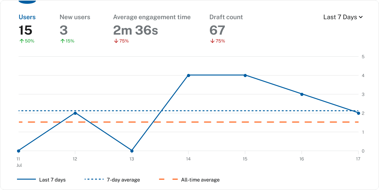
To answer those initial questions, I met with members of our data science and development team to discuss what kind of trends we can extrapolate from the data we gather, along with what data our users want to see. I also did research on popular data dashboards similar to Google Analytics and began making simple graph components that could support various data types.


Creating a consistent experience
It's always a good idea to make things based on what people are already familiar with, so when designing this dashboard and it's widgets, I tried to not reinvent the wheel and based the design loosely on a product our target users were already familiar with, Google Analytics.


Establishing scope
To begin designing the dashboard, I needed to ask a few questions about the project:
- Who are our target users? Who is interested in the data?
- What types of data are important to show? Do we have access to that data?
- Have our target users seen other forms of analytic dashboards before? What do they look like?
Laying the groundwork
To answer those initial questions, I met with members of our data science and development team to discuss what kind of trends we can extrapolate from the data we gather, along with what data our users want to see. I also did research on popular data dashboards similar to Google Analytics and began making simple graph components that could support various data types.
Showcasing the final prototype
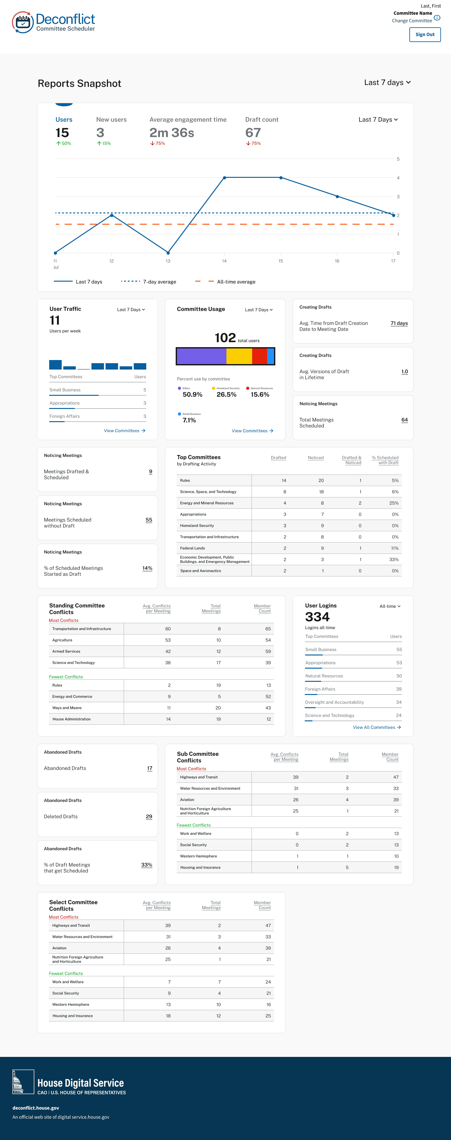
After creating a series of widgets, it was clear that making components similar to the designs in Google Analytics made it a lot easier for our development team by avoiding the need for custom built components. This allowed developers to use existing libraries and customize components out of the box instead of having to figure out how to hard-code these graphics from scratch.
The final dashboard was then adopted by my team and was used to showcase Deconflict and it's performance at the annual Congressional Hackathon which was hosted by House Digital Service.
Takeaways:
- Consider whether it's worth to buy vs. build
- Design in a way that people are familiar with
- Understand the totality of the problem before rushing to a solution
Reflections:
Through working on this project, I learned the importance of designing experiences that behave how the user expects them to behave. It was challenging to have to consider so many facets of the solution from construction to implementation, but ultimately really rewarding to reach a solution where all parties involved are happy with the results and the product is working as intended.


footer essentials
present
let's be friends
footer essentials
present
let's be friends
footer essentials
present
let's be friends